Custom CSS in Themes is a powerful way to tailor the appearance of your Usetiful content to better match your brand or design preferences.
To create a new theme:
Click Themes in the top menu while signed in.
Click + Create new theme in the top-right corner.
Below are a few examples of custom CSS customizations:
| Customize background color and it's transparency | .#{$classNamePrefix}-modal-inner, .#{$classNamePrefix}-bubble, .#{$classNamePrefix}-slideout-inner, .#{$classNamePrefix}-notification-inner{ background: rgba(255,255,255, 0.4); } .#{$classNamePrefix}-bubble.top .pointer-below{ border-top-color: rgba(255,255,255, 0.4); } .#{$classNamePrefix}-bubble.left .pointer-below{ border-left-color: rgba(255,255,255, 0.4); } .#{$classNamePrefix}-bubble.right .pointer-below{ border-right-color: rgba(255,255,255, 0.4); } .#{$classNamePrefix}-bubble.down .pointer-below{ border-bottom-color: rgba(255,255,255, 0.4); } .#{$classNamePrefix}-content { background: transparent; } |  |
| Fully-rounded buttons | .#{$classNamePrefix}-button { border-radius: 20px; } |  |
| Elements without rounded corners | .#{$classNamePrefix}-modal, .#{$classNamePrefix}-modal-inner, .#{$classNamePrefix}-bubble, .#{$classNamePrefix}-bubble-inner, .#{$classNamePrefix}-slideout, .#{$classNamePrefix}-slideout-inner, .#{$classNamePrefix}-notification, .#{$classNamePrefix}-notification-inner, .#{$classNamePrefix}-title{ border-radius: 0 !important; } |  |
| Change border color of pointer | .#{$classNamePrefix}-bubble { border: 1px solid red } .#{$classNamePrefix}-bubble.top .pointer-up { border-top-color: red; } .#{$classNamePrefix}-bubble.left .pointer-up { border-left-color: red; } .#{$classNamePrefix}-bubble.right .pointer-up { border-right-color: red; } .#{$classNamePrefix}-bubble.down .pointer-up { border-bottom-color: red; } .#{$classNamePrefix}-bubble .pointer::before { border-color: red; } |  |
| Switch feedback emoji's from happy>neutral>sad to sad>neutral>happy | #{$classNamePrefix}-feedback, .#{$classNamePrefix}-feedback-title { -moz-transform: scale(-1, 1); -webkit-transform: scale(-1, 1); -o-transform: scale(-1, 1); -ms-transform: scale(-1, 1); transform: scale(-1, 1); } | |
| Highlighting overlay | .#{$classNamePrefix}-modal::before, .uf-overlay.uf-visible { opacity: 0.2; } | |
| Customizing the Position of the Usetiful Button Below the Checklist | [data-uf-content="checklist"]{ bottom: 50px !important; } |  |
| Centralize Banner's content alignment | .#{$classNamePrefix}-bannerText .content div{ text-align: center !important; align-items: center !important; } | |
| Customize Smart Tips Icon to Show a "NEW" Badge | .#{$classNamePrefix}-beacon__iconic { min-width: 46px; height: 22px; padding: 0 10px; border-radius: 999px; } .#{$classNamePrefix}-beacon__iconic:after { justify-content: center; height: 100%; font-size: 11px; font-weight: 700; letter-spacing: 0.3px; } .#{$classNamePrefix}-beacon__iconic-question:after { content: "NEW" } | 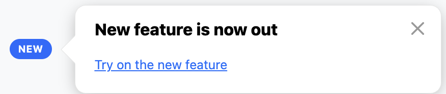 |
To learn on how to add custom images to your Usetiful buttons, check out this article.
To customize the Usetiful button positioning, check out this article.
To learn more about customize your Smart Tips Icon to show a "NEW" Badge, check out this article.